we RENOVATED OUR BRAND TO
EMPOWER MORE YOUNG PEOPLE
Brand Overview

For more than a century, the Boys & Girls Clubs have helped put young people on the path to great futures. We do whatever it takes to ensure all kids have a great future.
In 1860, the roots of what would eventually evolve into the Boys & Girls Clubs of America were planted in Hartford, Connecticut. Four visionary women—Mary Goodwin, Alice Goodwin, Elizabeth Hammersley, and Louisa Bushnell—embarked on a transformative journey. Fueled by the belief that young boys, left to wander the streets, deserved a more constructive alternative, they laid the groundwork for the inaugural Club. Built on the foundational principle of character development, the Club meticulously channeled the boys' interests, cultivated improved behavior, and kindled their personal ambitions.
From these modest beginnings, a profound mission emerged. In a significant stride toward inclusivity, the national organization took a historic step in 1990 by officially adopting the name "Boys & Girls Clubs of America," signifying an unwavering commitment to both genders. This pivotal moment reverberated in the halls of Congress, leading to the amendment and renewal of the charter to align with this new vision.
Timeline

New Logo Sketches
We have meticulously crafted and iterated through multiple rounds of logo sketches, each grounded in three key concepts. While these sketches offer a glimpse into our creative process, we invite you to delve into our Visual Development Guide for a comprehensive understanding of the entire journey.

Our New Identity
Logo
The Boys & Girls Clubs of America's new logo is a symbolic representation featuring a fan with six distinct pieces surrounded by six dots. This emblem encapsulates the spirit of collaboration and unity among young individuals. Our aspiration is for American youth to foster mutual assistance and collective improvement.
Color Palette
The color palette chosen for this logo comprises dark grey, fresh green, and warm red. The dark grey symbolizes the organization's enduring history and steadfast foundation. Fresh green embodies the vibrant and dynamic energy of the youth, while warm red signifies the integration of innovative technologies, positive attitudes, and a sense of responsibility inherent in the growth journey of young individuals. As we work together, support each other, and embrace a culture of innovation, positivity, and responsibility, we aim to collectively progress towards a brighter future.

Logo Anatomy
The creation of the new logo commences with a 14x14 rectangular matrix. At its midpoint, a 12x12 square is drawn. Following this, a 9x9 circle and an 8x8 circle are added, ensuring that the latter intersects the second point of the top line of the 12x12 square and the center of the square. The 8x8 circle should also cross the third point of the top line of the 12x12 square, resulting in the formation of one petal. This petal shape is then rotated 60 degrees six times to complete a full 360-degree shape.
To refine the design, an additional 8x8 circle is drawn at the center of the matrix. Six middle points between each petal are identified, and from these points, six 1/5 x 1/5 circles are meticulously drawn, using the middle points as the centers of these circles.

Business Stationery
The business stationery design of the new Boys & Girls Clubs of America includes notebook, business cards, envelopes and letter paper.

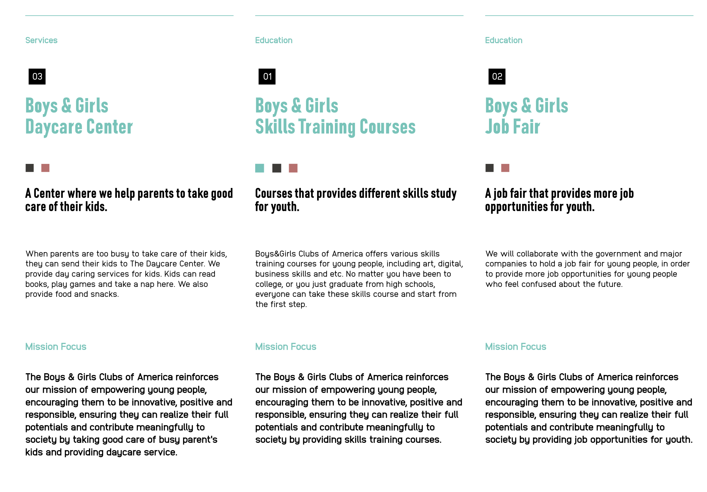
Explore The New Brand Universe
In the coming years, we possess boundless potential to explore diverse avenues and possibilities across various industries. We discover the potential trajectories for our growth in products, services, environments, experiences, educational opportunities, events, and co-branding. These possibilities are rooted in the brand soul of Boys & Girls Clubs of America and the newly defined brand mission.